La Croix

This week’s design share is La Croix.

unnamed-17.png

So what, La Croix?

In the last couple years, La Croix has become a sort of millenials’ drink due to a successful marketing campaign targeting millennials through social media. For years before that, I remembered the drink, with this splish-splashy textured look, being generally undesirable and considered not worth the price. And the packaging design never really changed despite this. Curious, I recently looked up the history of their branding and ultimately their packaging design. My finding: They had some awkward first years, but the design hasn’t changed since 2002! 

And the original reason that the design looks the way it looks is because of Perrier.

Screen Shot 2019-06-08 at 9.40.01 PM.png

Why Perrier

Perrier had been a leading sparkling water brand for almost a century. The company started in 1898 and was originally French, with the carbonated water historically coming from a spring in southern France. (Pronouce “peh-ree-ey,” not “per-ree-er.”) In 1992, the company Perrier was then bought by Nestlé, which is a Swiss company for any who didn’t know. Their branding hasn’t changed also, aside from occasional packaging variations, like their aluminum can.

Then La Croix was born

In 1981, in La Crosse, Wisconsin, La Croix was introduced as one of the first “Anti-Perrier” brands, meant to target sparking water consumers put off by Perrier’s “snobbish positioning.” The brand was designed to look the opposite of Perrier — approachable and all-people friendly for any occasion.

(caption: from the awkward first two decades)

(caption: from the awkward first two decades)

In 2002, National Beverage Co. purchases La Croix and assigns the redesign project to branding and design firm Alchemy Brand Group, headed by Lyle Zimmerman.

After weeks of experimentation, Alchemy invited over the honchos at National Beverage for a “big reveal.” Zimmerman presented around 20 options. The National Beverage reps chose three to move on to the next phase: consumer research.

unnamed-23.png

“In a sea of logos that were more sedate, precious in size, and often sans serif, the script denoted movement, energy, and fluidity—all traits applicable to water and especially the effervescence of LaCroix.” — Zimmerman

The outcome of the user testing: The design least favored by National Beverage’s management team was the one target consumers liked the best! An interesting marketing tactic is that the design works especially well, not as a sparkling water brand among other sparkling water brands, but as an alternative to soda, specifically aiming at consumers avoiding sugary drinks. 

And that is how La Croix looks the way it looks.

… I still haven’t figured out why La Croix ever began writing their grapefruit flavor in French (pamplemousse) while the other flavors like lemon, orange and coconut stay in English. This is yet a mystery to me. Shall we ever know?


This week’s sign-off is an art piece by Moebius, one of the most well-known science-fiction/fantasy illustrators in history:

unnamed-24.png

I love those lines, choice of gradients and flow of direction.


Hope you enjoyed!

Jane Choi

Moxie Sozo

This week’s design share is Moxie Sozo, a creative agency based in Boulder, Colorado.

The studio does all kinds of development, design and marketing work, including brand identities, content strategy, packagingdesign, and website design. My mind is on a lot of food brands and design lately because of an upcoming campaign for City of Hope, and among Moxie Sozo’s portfolio work are some vibrant, entertaining examples of food branding/design.


Icelandic Provisions (Traditional Icelandic Skyer)

Skyr is categorized as a yogurt, and this brand is my current favorite to eat. Typically the color blue is not a color used for food and beverage, because blue in food indicates deadness or other negative connotations. Here, Iceland Provisions’ primary brand color, blue, together with the contrasting white space hint at the refreshing hilly environment from which it originates and helps convey ‘light’ and ‘clean’ which is what this skyr tastes like. And the fruit illustrations are so cute.

unnamed-6.png
 

Jade Monk (Matcha Tea)

These are some crazy looking illustrations. The ferocity of the characters contrasted with what is typically a soothing and peaceful-feeling object (matcha tea) is startling, definitely stands out and is unforgettably intriguing. Staring at it, I wonder, “But why?! Is that what my face will look like when I drink this matcha?” I guess I’ll have to try it to find out.

unnamed-7.png
 

Good Day Chocolates (Chocolate with Supplement)

There are a lot of great chocolate packaging designs out there, but the best part about this one is the interaction with the character of the package, using only illustration and paper. Honestly, it’s a little creepy, but it feels more alive. … which probably adds to the creepiness. It’s so fun.

unnamed-8.png
 

This week’s sign-off is AI Earth Summit, run by AI LA — Artificial Intelligence Los Angeles, a community where “we explore artificial intelligence, machine learning, and other frontier technologies, and the impacts they will have on humanity. We acknowledge that AI is influenced by both art and science, and that human concerns outweigh technological ones.”

unnamed-9.png

I’ve attended a few AI LA events where experts and professionals in various fields relating to AI design/development, along with any relevant theme like the environment or social issues, share what’s going on lately, their own perspectives, possibly discuss their research, and so on. It can be very educating, exciting in terms of what the future might hold, and uplifting when discussing what kind of positive outcomes may occur.


Hope you enjoyed!

– Jane

Design and a Squirrel

This week’s design share shows a few design pieces that I found inspiring, whether I use what I learn for work or not. A lot of art and design is an attempt to have the audience feel or think something. So here’s what I noticed…


ABSTRACTION & DIRECTION

unnamed.png

Since illustration is my background, I tend towards a method of ‘drawing’ out compositions, and I’m particular about directional lines, depth and readability. In this design piece, the abstract shapes and blobs of texture, vaguely resembling naturally-occurring beachside forms, overlap and run into each other to create a community of direction, leading one part to another.

unnamed-1.png

The forms look like they’re all having a conversation! This essentially communicates the event to be fun, interactive, and nature-related without being able to read French.


EXPRESSION OF ATMOSPHERE

unnamed-2.png

I really appreciate when designers and illustrators make good use of negative space. In this piece, the concept uses the sky to communicate ‘sound’ drifting out in space, as though sound is just like the floating motes of light and fireflies, pleasant and memorable for a summer evening.


TYPE + PHOTO

unnamed-3.png

… I’m not sure why I found this design hilarious. Maybe because I think Nadal’s expressions are funny. Maybe it’s the design — masking out the type from their bodies creates an oddly comical effect with their floating upper body; however, it is memorable and very lively, almost vibrating with high contrast. Clearly, Nike and the Dubai Open are promising some great action and sports entertainment. I wanted to share this one, because although masking type from human figures is a funny idea to me, I think it’s a good technique to keep in mind for other non-human objects or spaces.


This week’s sign-off is a photo by Xun Chi, taken in Yosemite:

unnamed-4.png

… The cutest, perfectly captured half-second.


Hope you enjoyed!

– Jane

Searching for Colors

As most of the designers are working on concepts for a big project, I thought some tools here and there might help the brainstorming. This week’s design share are a few color palette finders.


Coolors

The “Explore” tab shows user-generated color palettes. Once you create an account on the website, you can favorite/bookmark color palettes for your reference on any project. When you click to view one, the palette will display full browser-screen and show hex code, CMYK and RGB. You can adjust them, reorder them, or lock them down while adjusting a single color.

unnamed-11.png
 

Color Hunt

The landing page shows user-generated color palettes to choose and edit as you see fit. I like this website for the way it shows the palettes — from largest, probably primary color to the least used (maybe the text color).

unnamed-12.png
 

Colour Lovers 

This is a collection of user-generated color palettes, patterns and swatches. The website’s content is more complex and filled with more visual variety than the other color websites.

unnamed-13.png
 

Colormind

This website shows AI-generating color palettes. The AI picks out a color palette for the day, and it also selects from various things in culture, like films, paintings or video games, and churns out an elegant color palette from each. It’s an interesting tool if maybe not so useful for our design work.

unnamed-14.png
 

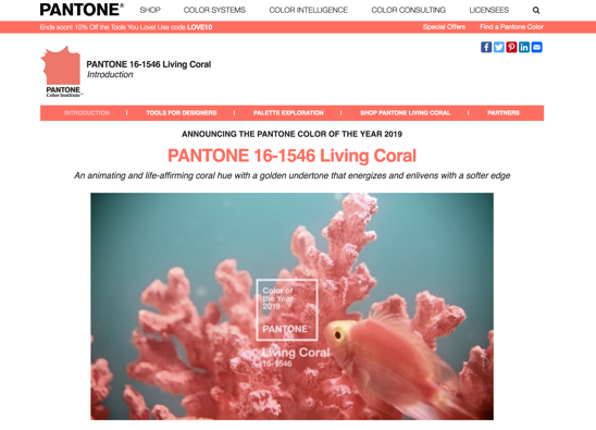
PANTONE®

Don’t forget PANTONE®! The writings under Color Intelligence are interesting, and I like to check the Color of the Year and what is said about it.

unnamed-15.png
 

Earth Day passed, but really, every day should be Earth Day. This week’s sign-off is a recommendation to watch One Planet, the new BBC TV series narrated by David Attenborough, available on Netflix Streaming:

unnamed-16.png

From the intro of Episode 1:

“When human beings built their first settlements, some 10,000 years ago, the world around them, on the land and in the sea, was full of life. For generations, this stable Eden nurtured our growing civilizations. But now, in the space of just one human lifetime, all that has changed. In the last fifty years, wildlife population have on average declined by 60 percent. For the first time in human history, the stability of nature can no longer be taken for granted. But the natural world is resilient. Great riches still remain. And with our help the planet can recover. Never has it been more important to understand how the natural world works and how to help it.”


Hope you enjoyed!

– Jane

Wall Artype

This week’s design share is typography that is wall art. I’ll spotlight on a few favorite artists of mine.

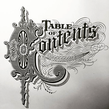
Peter Greco does some awesome calligraphic work, some of which can be seen in downtown LA. Much of his work look like illuminated manuscripts. He teaches Expressive Type at Art Center and presently continues creating awesome designs on walls and other objects (like skateboards, dishware, playing cards, etc).

See his Instagram which updates with more current work and variety: https://www.instagram.com/petergrecoart/?hl=en

image001.png
image002.png
image003.png

Gemma O'Brien’s work has a more contemporary look, painting script as easily as sans serif type. There is a certain spunk and freedom that is expressed in her work, while remaining bold and full of grace. She is Australian illustrator and designer and utilizes both traditional and digital media to obtain desired results; she was among the featured artists to promote Adobe Photoshop Sketch.

Check out her Instagram for more current work and in-progress views:  https://www.instagram.com/mrseaves101/?hl=en

image004.png
image005.png
image006.png

Ben Johnston is a Toronto-based type artist who toys with perception and perspective using letterforms. His work tends to use simpler sans serif or brush letterforms, but they play with the environment, give you optical illusions and make you take a second or third look if you pass by on the street.

See his Instagram for more current work and/or in-progress views:  https://www.instagram.com/benjohnstondesign/?hl=en

image007.png
image008.png
image009.png
 

This week’s sign-off is a craft fair that seems like a big thing: Renegade Craft Los Angeles

image010.png

April 6-7 — Enjoy a weekend in Los Angeles State Historic Park shopping from 200+ local and national Makers and Designers, eating from food trucks, sipping on craft cocktails, hanging out under canvas tents, creating block prints, and enjoying the Park’s springtime bloom.

Hello, block prints.

Also their website design is en pointe.

Typography of Asian Languages

This week’s design share is a look at typography across a few different cultures.

Generally, due to the wide use of internet, design trends end up blending together across the world. You might see similar techniques and styles in different cultures. However, because of each language’s uniqueness, typography using different languages can sometimes be used and designed in ways that may not be intuitive for when designing with English (or other Latin languages). Below, I’ll cover broader perspectives specifically related to how we design.


Of the Asian languages, Chinese, Japanese, and Korean traditionally read and write in a grid format. When children learn to write, they use grid paper, not lined paper.

gridpaper.png

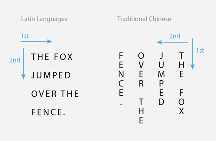
Written Chinese characters especially can be different because classical Chinese was originally written and read from top to bottom AND right to left. Because the written languages from Japan and Korea have some roots and/or overlap with Chinese, characters from both also can be written  from top to bottom (which is a more traditional way) just as well as from left to right (the more modernized way).

readingway.png

Japanese uses several main sets of characters to express their language — Hiragana, Katagana, and Kanji. All three can be used alongside each other in the same word or sentence. Kanji is based on Chinese. Japanese can be read comfortably from top to bottom like Chinese, in columns.

Modernized Korean does not use Chinese characters in writing, so most copy is written from left to right like Latin languages. Korean is not typically written in columns, unless there is specific intent, such as an expression of classical methodology, history or literature, or a feeling of “extraordinary” like the way English characters can be laid out.

Hence, often the characters from these languages can be laid out in obvious grids, sometimes with characters in columns rather than rows, and still read as it’s supposed to. When the characters or designs do break out of their grids, fun cool things happen.

Chinese

Japanese

Korean

I know less about the Arabic language, but the most interesting aspects to me are that it reads right to left and there are a lot of ascenders and descenders in script. It looks beautiful and almost immersive when taking in all the lines.

Arabic

An easy way to view typography in other cultures is to search in Pinterest! There are some amazing pieces to be inspired from.

This week’s sign-off is an Instagram post from NASA:

nasainstagram.png

Shine bright like a cluster
@NASAHubble has done it again. This image reveals a globular cluster of stars in the constellation of Sagittarius, 18,000 light-years away from Earth.

Don’t forget to shine bright today.

Noun Project

This week’s Design Share is a website called The Noun Project.

unnamed-25.png

The Noun Project is basically a search engine platform for monochrome icons. For a subscription fee, they also offer downloadable files of the icons. It’s one of the best icon websites I’ve ever encountered, with sleeker polished designs and a search-engine algorithm that seems smarter and more intuitive, showing you the results you want rather than throwing so many variations at you to sell files as much as they can.

Why I shared: In our work, there are often times that we need visuals for vague topics like “integrated islet distribution program,” etc. The Noun Project has helped me key in words like “distribution” or “research” and reveal monochrome-icon results that are varied, tidy, and creative — above all, the search is fast. I easily discover ideas for the visuals I need using this tool much more quickly than skimming through hundreds of istock/getty or google search results.

unnamed-26.png
unnamed-27.png

I have only recently found The Noun Project, so let us know if you discover anything else cool about it and which tools you use if you have any!


Have a great weekend!

– Jane