Typography of Asian Languages
This week’s design share is a look at typography across a few different cultures.
Generally, due to the wide use of internet, design trends end up blending together across the world. You might see similar techniques and styles in different cultures. However, because of each language’s uniqueness, typography using different languages can sometimes be used and designed in ways that may not be intuitive for when designing with English (or other Latin languages). Below, I’ll cover broader perspectives specifically related to how we design.
Of the Asian languages, Chinese, Japanese, and Korean traditionally read and write in a grid format. When children learn to write, they use grid paper, not lined paper.
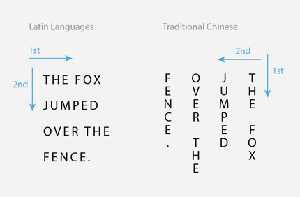
Written Chinese characters especially can be different because classical Chinese was originally written and read from top to bottom AND right to left. Because the written languages from Japan and Korea have some roots and/or overlap with Chinese, characters from both also can be written from top to bottom (which is a more traditional way) just as well as from left to right (the more modernized way).
Japanese uses several main sets of characters to express their language — Hiragana, Katagana, and Kanji. All three can be used alongside each other in the same word or sentence. Kanji is based on Chinese. Japanese can be read comfortably from top to bottom like Chinese, in columns.
Modernized Korean does not use Chinese characters in writing, so most copy is written from left to right like Latin languages. Korean is not typically written in columns, unless there is specific intent, such as an expression of classical methodology, history or literature, or a feeling of “extraordinary” like the way English characters can be laid out.
Hence, often the characters from these languages can be laid out in obvious grids, sometimes with characters in columns rather than rows, and still read as it’s supposed to. When the characters or designs do break out of their grids, fun cool things happen.
Chinese
Japanese
Korean
I know less about the Arabic language, but the most interesting aspects to me are that it reads right to left and there are a lot of ascenders and descenders in script. It looks beautiful and almost immersive when taking in all the lines.
Arabic
An easy way to view typography in other cultures is to search in Pinterest! There are some amazing pieces to be inspired from.
This week’s sign-off is an Instagram post from NASA:


